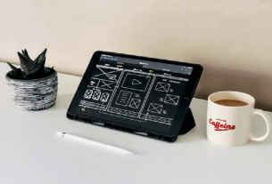
Newest Trends for Designing a Website – When a website becomes your business identity, it’s important to make it perfect and the first clause of the perfect website is its perfect design. Your website represents your business’s visual outlook. An eye-soothing design is equally important like the responsive web design. Web world is ever changing. There is only one constant in the world of web design and development and that is transform. Changing is a trend which you have to follow to survive the race.
Newest Trends For Designing A Website
Single Page website
The concept continuing itself from the previous year. But it’s been proved that the single page-long scrolling web format is here to stay in few more years. A possible explanation to it is that users are so accustomed to vertical scrolling that it’s actually become unreasonable to split the content in several parts on separate pages – users have to make extra effort to get the full content.
Use photo background
Another design which is in trend and you should try it for your own site, is the background photo. For quite some time centers around photography become quite popular. Pioneered by fashion brands and photographers, this design approach is now successfully used virtually in almost every industry. Also Know:- How To Increase Website Traffic
Photo backgrounds are great for branding and presentation purposes when your main objective is to make a strong visual statement. This is why it’s used so often by fashion brands, travel companies, and many others creative workers.
Hidden menu
Adopting design for smaller screens has also affected how menus are displayed – and with space being at a premium, fly out, slide out and hidden menus are becoming more popular across the board. It’s all about bringing an app-like feel to an whole site.
Flat design
Flat design is one of our personal favorites. It is how it sounds, design by using objects that are uniform in color or appearance. It’s a minimalist approach to design. A few years back, textures were very popular. Now, with mobile devices and responsive design, it is harder to make these textures work well across multiple devices.
Flat design gives the feel of layers and depth with flatter colors and minimalist design techniques. This way it’s much easier to make the design work on multiple devices.
Brick like format
The format is also related to flat design concept. This trend generally introduces a brick-like design, kind of grid featuring blocks of solid color coupled with blocks of photos or text. Users and designers stick with it because of its simplicity. The contrast between blocks of colors and images/text blocks create a strong visual interest which usually stimulates users to explore more.
Parallax
It is a design and coding trend that is very popular nowadays. Parallax means two or more parallel objects moving at different speeds.” Parallax scrolling technique is used to break up the linear monotony of a website by having various
objects scroll at different paces. Parallax will really become much more popular as more modern browsers support it, but even now there are already a lot of beautifully designed sites utilizing parallax scrolling. But this is the one thing you want to be very careful with. Sometimes the effect can be a little huge to your audience.
But rather than that, it is visually compelling and can add motion to a site without using Flash or video. Parallax will give the appearance how the background is moving at a different rate than the foreground of a page.
Ghost button
Ghost buttons are those transparent empty buttons bordered with a very thin line and containing light. They are usually in sans-serif font. You have definitely seen them over the last year, and you can certainly expect to see more.
Simplicity is best
As far as possible make it simple. Eliminate unnecessary concept and pages. You should not overwhelm your viewers by giving multiple choices. Rely more on design rather content. It will drive more conversation. Use large visual heading for make it attractive.
Typography
Nowadays typography is in trend. Sometime back, designers had their limitation for using typefaces, as they had standard typefaces available in their computers. But those days are gone. Web font foundries such as Google fonts and Type kit allow you to use a virtually unlimited number of fonts for your web design. Designers have been taking advantage of this opportunity for some time now, and more and more sites are built with strong attention paid to typography.
Your website’s first and foremost criteria should be you audience. Website design shouldn’t be a matter of what one individual thinks is cool. Your design serves a purpose. Think about your audience’s needs. Use these techniques above to fulfill their demand. Design can be fun; it can be interesting or even ground breaking. But, always make sure it supports your goals.
If you are looking for the best IT Services Company in Udaipur and Summer Training in Udaipur, then you should go with Ranjeet Computer Academy.
Contact us:
- Mobile No: +91-9460324253, +91-8239991144
- Website: http://www.ranjeetcomputeracademy.com/


